


Timeline: June 20 - June 30
My Role: Product Designer
Introduction
Audioghar is one of Nepal’s leading audiobook platforms catering to over 10,000+ users. In the new design, we set out to solve the problems below within 10 days.
My Role
I led the whole redesign, and user testing from end to end. I also suggested some new feature changes to the app for a better user experience.
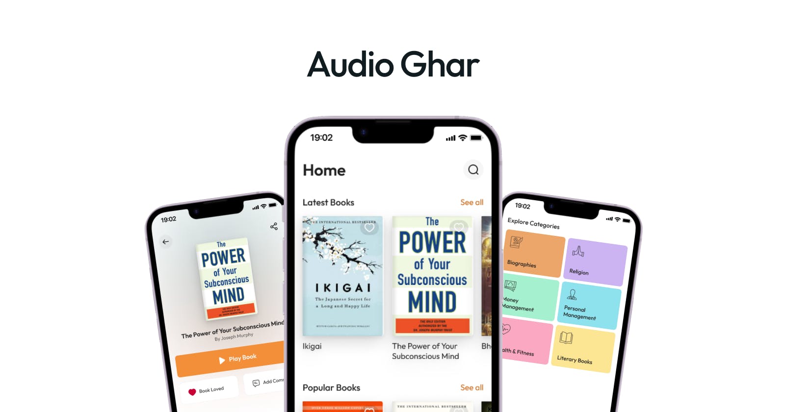
The Redesign
But why redesign?
Audioghar was facing issues with the current state of the user interface. There were some places where the user flows were not convenient.
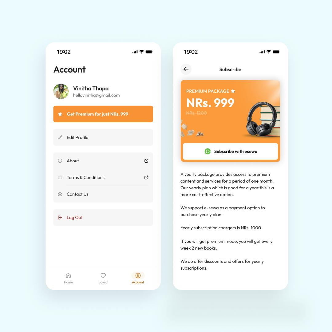
The premium version of the app was not well highlighted for the users.
A dedicated place for a favorite book was missing.
Moreover, the app felt less interactive as when users performed x action (e.g. adding a comment), the user did not receive a quick notification anywhere.
So, we went all in to solve all those problems in our redesign.
Targeted Goals
Better user interface
Seamless user experience
Highlight the premium app feature and motivate users toward it
Scope of Redesign
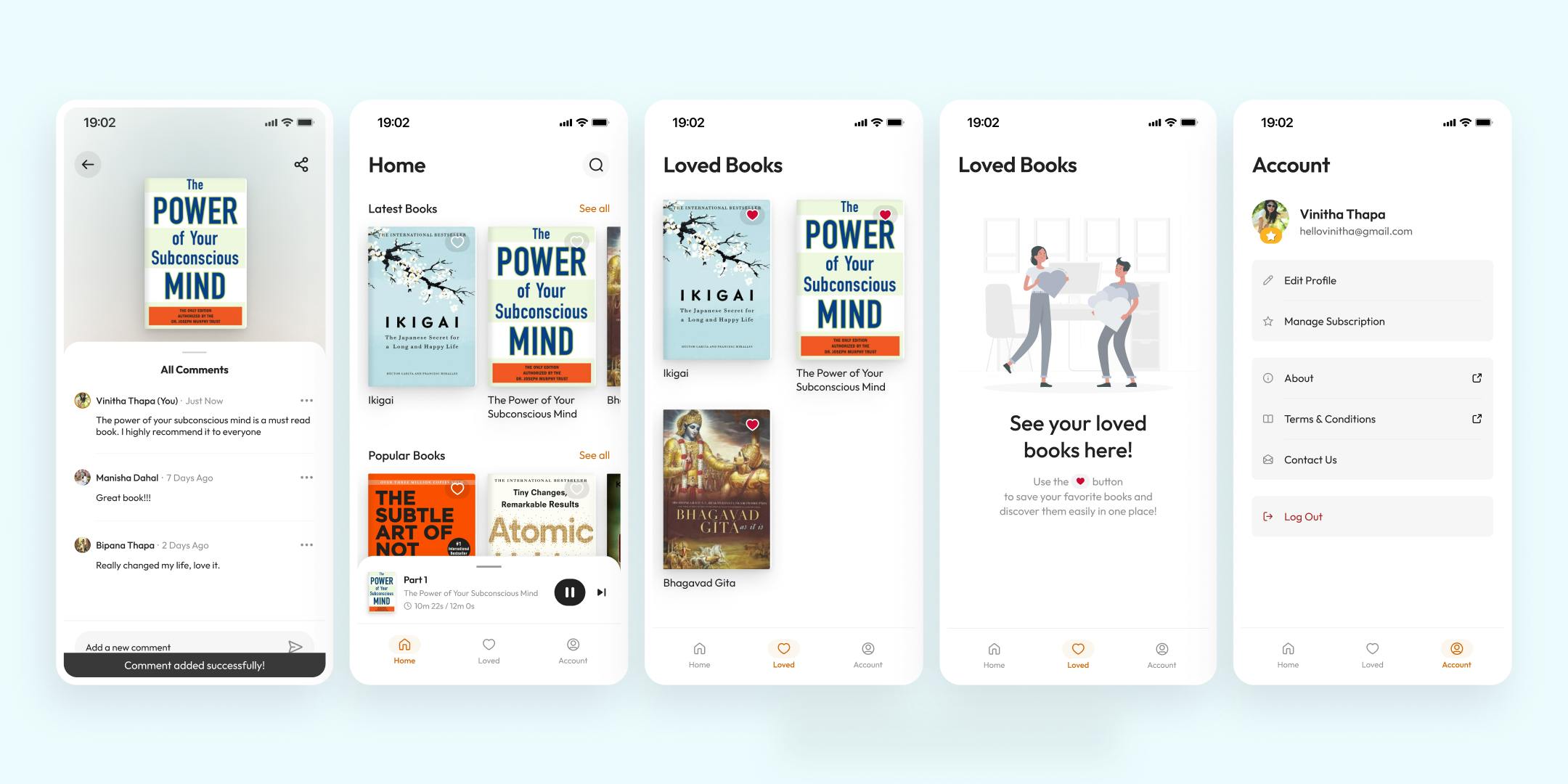
We were bound to redesign just the existing app and add no extra features. However, we proposed to convert the pre-existing feature of liking a book to favorites and add a dedicated place for seeing the favorite books.
Redesign Process
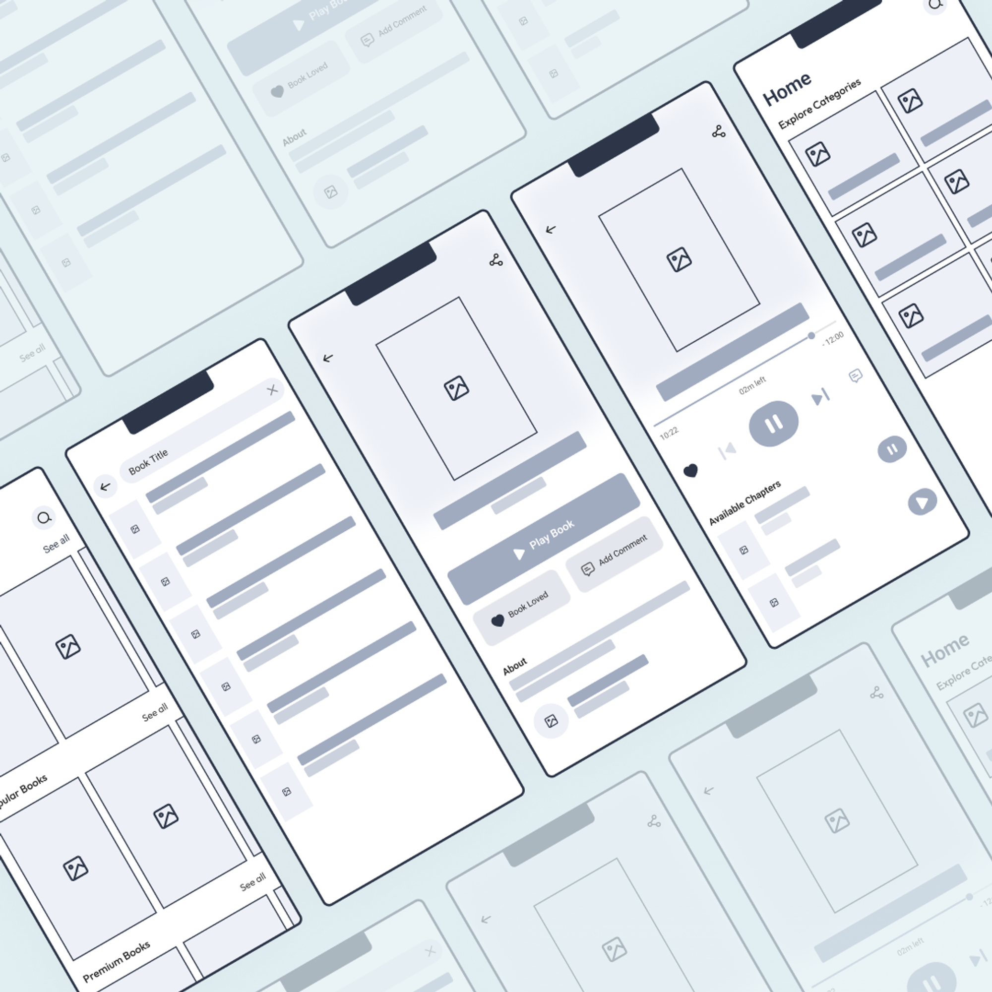
1. Wireframes
We drew wireframes to make foundations for the new layout. The wireframes were then verified with stakeholders, then we moved to UI Design.
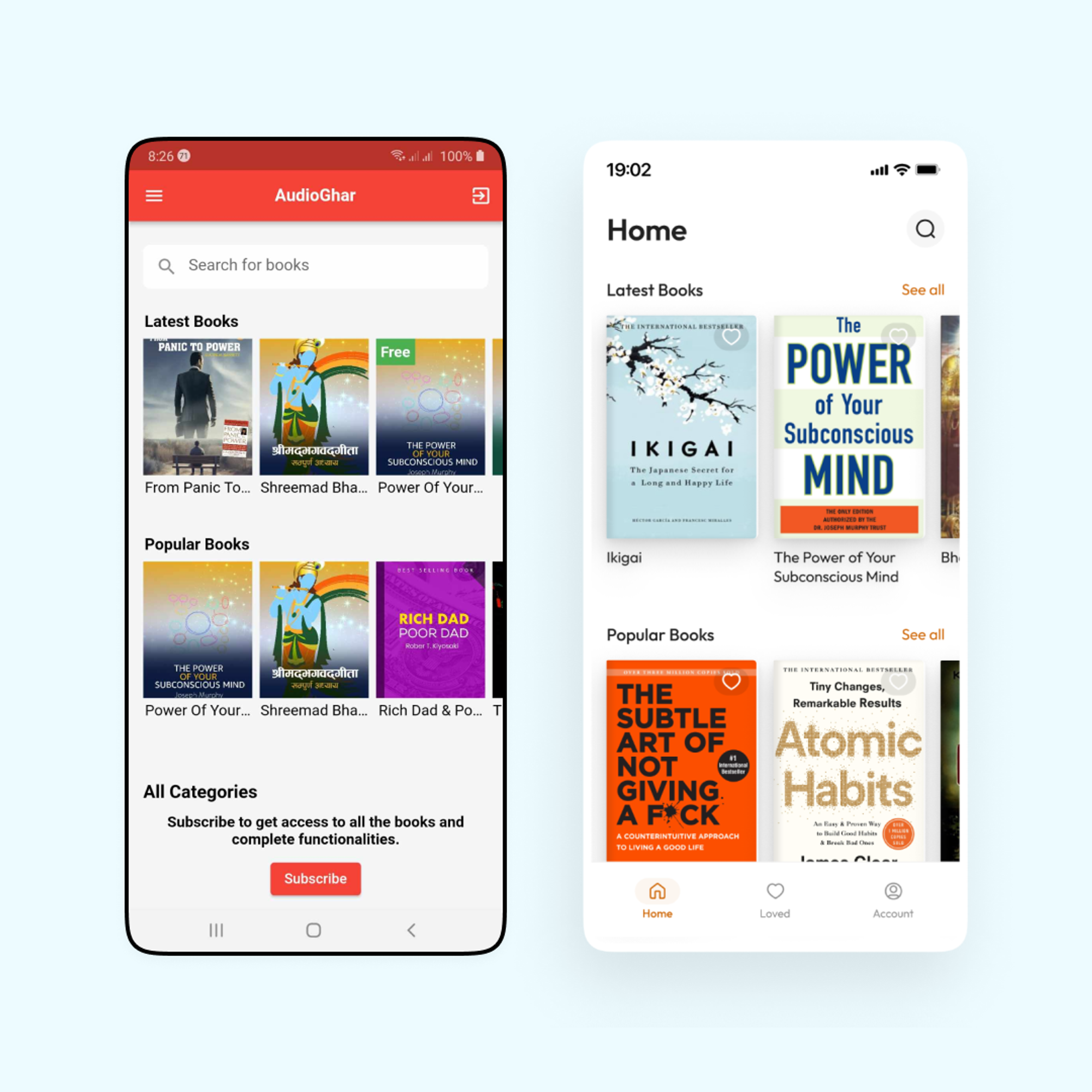
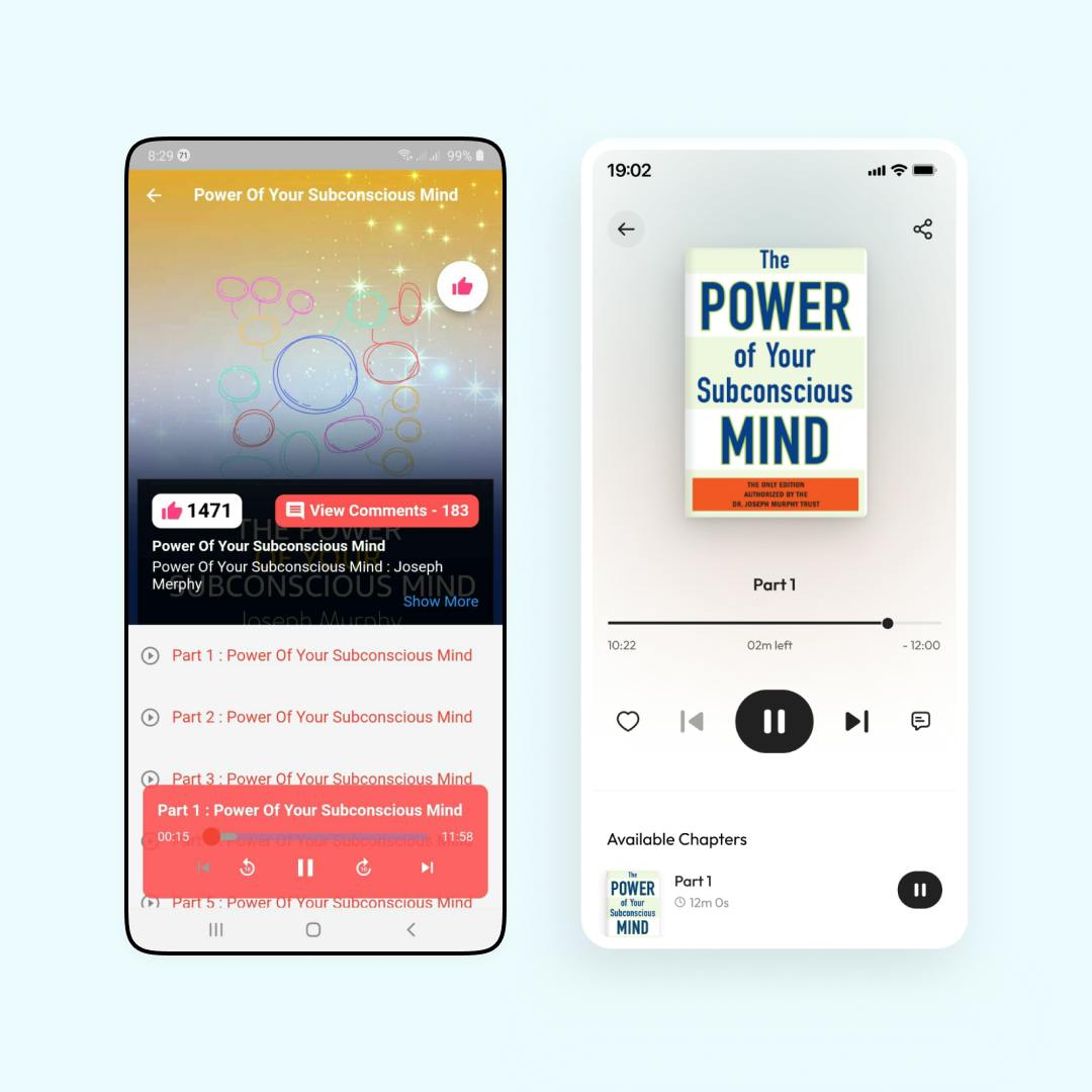
2. Redesigns
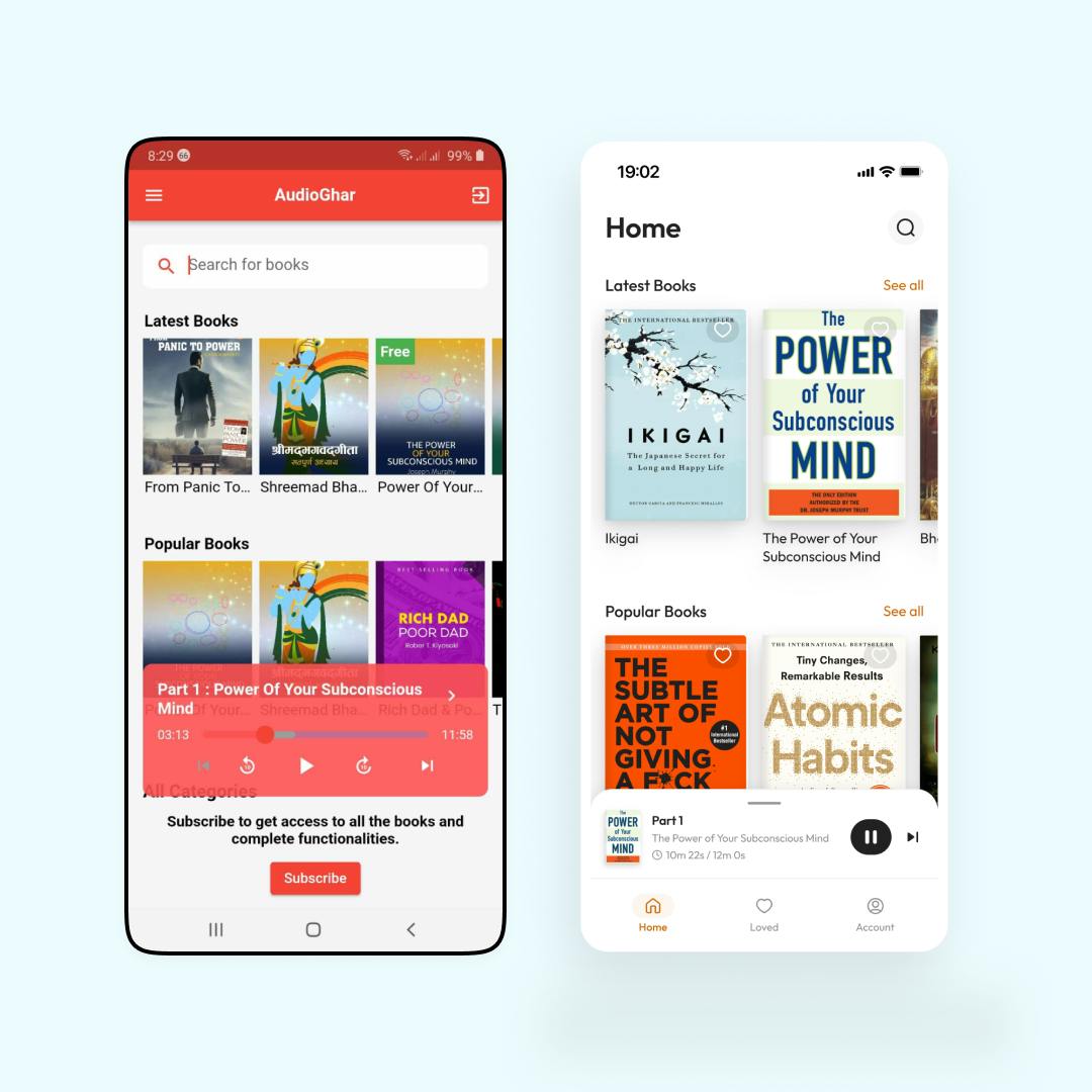
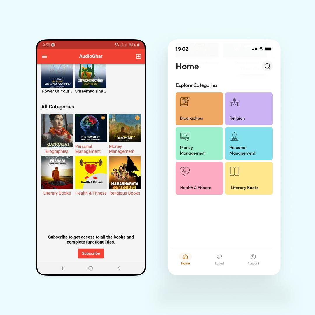
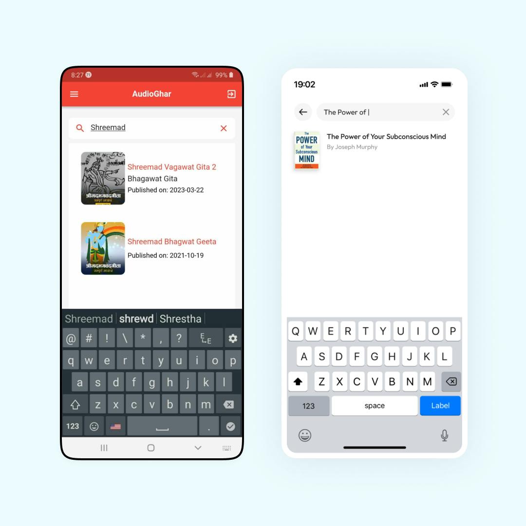
The redesign became fairly simple after the wireframe designs. Here is how the redesign actually looks (with the original screen on the left).
I will be posting more of my work, so subscribe to this blog to get notified.
Thank you for reading this. Cheers.